# Project : bootstrap-datetimepicker
======================================
[](https://travis-ci.org/smalot/bootstrap-datetimepicker)
[Homepage](http://www.malot.fr/bootstrap-datetimepicker/)
[Demo page](http://www.malot.fr/bootstrap-datetimepicker/demo.php)
# Project forked
This project is a fork of [bootstrap-datepicker project](https://github.com/eternicode/bootstrap-datepicker).
# Home
As 'bootstrap-datepicker' is restricted to the date scope (day, month, year), this project aims to support too the time picking (hour, minutes).
# Screenshots
## Decade year view

This view allows to select the day in the selected month.
## Year view

This view allows to select the month in the selected year.
## Month view
This view allows to select the year in a range of 10 years.
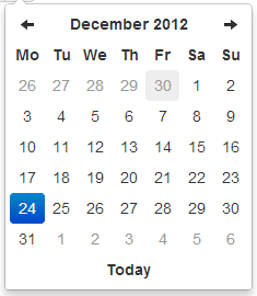
## Day view

This view allows to select the hour in the selected day.
## Hour view

This view allows to select the preset of minutes in the selected hour.
The range of 5 minutes (by default) has been selected to restrict buttons quantity to an acceptable value, but it can be overrided by the minuteStep property.
## Day view - meridian

Meridian is supported in both the day and hour views.
To use it, just enable the showMeridian property.
## Hour view - meridian

# Example
Attached to a field with the format specified via options:
```html
```
```javascript
$('#datetimepicker').datetimepicker({
format: 'yyyy-mm-dd hh:ii'
});
```
Attached to a field with the format specified via markup:
```html
```
```javascript
$('#datetimepicker').datetimepicker();
```
As component:
```html
```
```javascript
$('#datetimepicker').datetimepicker();
```
As inline datetimepicker:
```html
```
```javascript
$('#datetimepicker').datetimepicker();
```
# Using bootstrap-datetimepicker.js
Call the datetimepicker via javascript:
```javascript
$('.datetimepicker').datetimepicker()
```
## Dependencies
Requires bootstrap's dropdown component (`dropdowns.less`) for some styles, and bootstrap's sprites (`sprites.less` and associated images) for arrows.
A standalone .css file (including necessary dropdown styles and alternative, text-based arrows) can be generated by running `build/build_standalone.less` through the `lessc` compiler:
```bash
$ lessc build/build_standalone.less datetimepicker.css
```
## Options
All options that take a "Date" can handle a `Date` object; a String formatted according to the given `format`; or a timedelta relative to today, eg '-1d', '+6m +1y', etc, where valid units are 'd' (day), 'w' (week), 'm' (month), and 'y' (year).
You can also specify an ISO-8601 valid datetime, despite of the given `format` :
* yyyy-mm-dd
* yyyy-mm-dd hh:ii
* yyyy-mm-ddThh:ii
* yyyy-mm-dd hh:ii:ss
* yyyy-mm-ddThh:ii:ssZ
### format
String. Default: 'mm/dd/yyyy'
The date format, combination of p, P, h, hh, i, ii, s, ss, d, dd, m, mm, M, MM, yy, yyyy.
* p : meridian in lower case ('am' or 'pm') - according to locale file
* P : meridian in upper case ('AM' or 'PM') - according to locale file
* s : seconds without leading zeros
* ss : seconds, 2 digits with leading zeros
* i : minutes without leading zeros
* ii : minutes, 2 digits with leading zeros
* h : hour without leading zeros - 24-hour format
* hh : hour, 2 digits with leading zeros - 24-hour format
* H : hour without leading zeros - 12-hour format
* HH : hour, 2 digits with leading zeros - 12-hour format
* d : day of the month without leading zeros
* dd : day of the month, 2 digits with leading zeros
* m : numeric representation of month without leading zeros
* mm : numeric representation of the month, 2 digits with leading zeros
* M : short textual representation of a month, three letters
* MM : full textual representation of a month, such as January or March
* yy : two digit representation of a year
* yyyy : full numeric representation of a year, 4 digits
### weekStart
Integer. Default: 0
Day of the week start. 0 (Sunday) to 6 (Saturday)
### startDate
Date. Default: Beginning of time
The earliest date that may be selected; all earlier dates will be disabled.
### endDate
Date. Default: End of time
The latest date that may be selected; all later dates will be disabled.
### daysOfWeekDisabled
String, Array. Default: '', []
Days of the week that should be disabled. Values are 0 (Sunday) to 6 (Saturday). Multiple values should be comma-separated. Example: disable weekends: `'0,6'` or `[0,6]`.
### autoclose
Boolean. Default: false
Whether or not to close the datetimepicker immediately when a date is selected.
### startView
Number, String. Default: 2, 'month'
The view that the datetimepicker should show when it is opened.
Accepts values of :
* 0 or 'hour' for the hour view
* 1 or 'day' for the day view
* 2 or 'month' for month view (the default)
* 3 or 'year' for the 12-month overview
* 4 or 'decade' for the 10-year overview. Useful for date-of-birth datetimepickers.
### minView
Number, String. Default: 0, 'hour'
The lowest view that the datetimepicker should show.
### maxView
Number, String. Default: 4, 'decade'
The highest view that the datetimepicker should show.
### todayBtn
Boolean, "linked". Default: false
If true or "linked", displays a "Today" button at the bottom of the datetimepicker to select the current date. If true, the "Today" button will only move the current date into view; if "linked", the current date will also be selected.
### todayHighlight
Boolean. Default: false
If true, highlights the current date.
### keyboardNavigation
Boolean. Default: true
Whether or not to allow date navigation by arrow keys.
### language
String. Default: 'en'
The two-letter code of the language to use for month and day names. These will also be used as the input's value (and subsequently sent to the server in the case of form submissions). Currently ships with English ('en'), German ('de'), Brazilian ('br'), and Spanish ('es') translations, but others can be added (see I18N below). If an unknown language code is given, English will be used.
### forceParse
Boolean. Default: true
Whether or not to force parsing of the input value when the picker is closed. That is, when an invalid date is left in the input field by the user, the picker will forcibly parse that value, and set the input's value to the new, valid date, conforming to the given `format`.
### minuteStep
Number. Default: 5
The increment used to build the hour view. A button is created for each minuteStep minutes.
### pickerReferer : deprecated
String. Default: 'default'
The referer element to place the picker for the component implementation. If you want to place the picker just under the input field, just specify input.
### pickerPosition
String. Default: 'bottom-right' (supported values are: 'bottom-right', 'bottom-left', 'top-right', 'top-left')
This option allows to place the picker just under the input field for the component implementation instead of the default position which is at the bottom right of the button.
### viewSelect
Number or String. Default: same as minView (supported values are: 'decade', 'year', 'month', 'day', 'hour')
With this option you can select the view from which the date will be selected. By default it's the last one, however you can choose the first one, so at each click the date will be updated.
### showMeridian
Boolean. Default: false
This option will enable meridian views for day and hour views.
### initialDate
Date or String. Default: new Date()
You can initialize the viewer with a date. By default it's now, so you can specify yesterday or today at midnight ...
### onRender
This event is fired when a day is rendered inside the datepicker. Should return a string. Return 'disabled' to disable the day from being selected.
```javascript
$('#date-end')
.datetimepicker({
onRender: function(date) {
return ev.date.valueOf() < date-start-display.valueOf() ? ' disabled' : '';
}
});
```
## Markup
Format as component.
```html
```
Format as component with reset button to clear the input field.
```html
```
## Methods
### .datetimepicker(options)
Initializes an datetimepicker.
### remove
Arguments: None
Remove the datetimepicker. Removes attached events, internal attached objects, and
added HTML elements.
$('#datetimepicker').datetimepicker('remove');
### show
Arguments: None
Show the datetimepicker.
```javascript
$('#datetimepicker').datetimepicker('show');
```
### hide
Arguments: None
Hide the datetimepicker.
```javascript
$('#datetimepicker').datetimepicker('hide');
```
### update
Arguments:
* currentDate (Date).
Update the datetimepicker with the specified date.
```javascript
$('#datetimepicker').datetimepicker('update', new Date());
```
Omit currentDate to update the datetimepicker with the current input value.
```javascript
$('#datetimepicker').datetimepicker('update');
```
### setStartDate
Arguments:
* startDate (String)
Sets a new lower date limit on the datetimepicker.
```javascript
$('#datetimepicker').datetimepicker('setStartDate', '2012-01-01');
```
Omit startDate (or provide an otherwise falsey value) to unset the limit.
```javascript
$('#datetimepicker').datetimepicker('setStartDate');
$('#datetimepicker').datetimepicker('setStartDate', null);
```
### setEndDate
Arguments:
* endDate (String)
Sets a new upper date limit on the datetimepicker.
```javascript
$('#datetimepicker').datetimepicker('setEndDate', '2012-12-31');
```
Omit endDate (or provide an otherwise falsey value) to unset the limit.
```javascript
$('#datetimepicker').datetimepicker('setEndDate');
$('#datetimepicker').datetimepicker('setEndDate', null);
```
### setDaysOfWeekDisabled
Arguments:
* daysOfWeekDisabled (String|Array)
Sets the days of week that should be disabled.
```javascript
$('#datetimepicker').datetimepicker('setDaysOfWeekDisabled', [0,6]);
```
Omit daysOfWeekDisabled (or provide an otherwise falsey value) to unset the disabled days.
```javascript
$('#datetimepicker').datetimepicker('setDaysOfWeekDisabled');
$('#datetimepicker').datetimepicker('setDaysOfWeekDisabled', null);
```
## Events
Datetimepicker class exposes a few events for manipulating the dates.
### show
Fired when the date picker is displayed.
### hide
Fired when the date picker is hidden.
### changeDate
Fired when the date is changed.
```javascript
$('#date-end')
.datetimepicker()
.on('changeDate', function(ev){
if (ev.date.valueOf() < date-start-display.valueOf()){
....
}
});
```
### changeYear
Fired when the *view* year is changed from decade view.
### changeMonth
Fired when the *view* month is changed from year view.
### outOfRange
Fired when you pick a date before the *startDate* or after the *endDate* or when you specify a date via the method *setDate* or *setUTCDate*..
### next:* / prev:*
Fired when you click the *next* or *previous* arrows. Supports all the differnt view modes ('year', 'month', 'day', 'hour'). For example allows you to bind a callback to 'next:month' or 'prev:month' action.
## Keyboard support
The datetimepicker includes some keyboard navigation:
### up, down, left, right arrow keys
By themselves, left/right will move backward/forward one day, up/down will move back/forward one week.
With the shift key, up/left will move backward one month, down/right will move forward one month.
With the ctrl key, up/left will move backward one year, down/right will move forward oone year.
Shift+ctrl behaves the same as ctrl -- that is, it does not change both month and year simultaneously, only the year.
### escape
The escape key can be used to hide and re-show the datetimepicker; this is necessary if the user wants to manually edit the value.
### enter
When the picker is visible, enter will simply hide it. When the picker is not visible, enter will have normal effects -- submitting the current form, etc.
## Mouse Wheel View Navigation
In order to make this plugin easier to set different part of date time, mouse wheel has been used to navigate through different views. Scroll up your mouse wheel to navigate to the decade year view. Scroll down will lead to the minute view.
### Dependency
To enalbe this feature. [jQuery Mouse Wheel Plugin](https://github.com/brandonaaron/jquery-mousewheel) must be included before using this feature.
### Options
#### wheelViewModeNavigation
Boolean. Default: false
Whether or not to enable navigating through different view mode using mouse wheel.
#### wheelViewModeNavigationInverseDirection
Boolean. Default: false
Whether or not to reverse the direction of scrolling. Default is scroll up to the decade view.
#### wheelViewModeNavigationDelay
Integer. Default: 100
Time delays between the next respond to the wheel command, it controls the speed between switching in different views. Unit is in million seconds.
#### About viewSelect option
The recommended value for viewSelect option is 4 when this feature is enable. That means you can easily update any the value in every view. This option value is applied in the demo page.
### Feature Demo
A simple [Demo](http://lyonlai.github.io/bootstrap-datetimepicker/demo.html) page is given to show it's simple idea.
## I18N
The plugin supports i18n for the month and weekday names and the `weekStart` option. The default is English ('en'); other available translations are avilable in the `js/locales/` directory, simply include your desired locale after the plugin. To add more languages, simply add a key to `$.fn.datetimepicker.dates`, before calling `.datetimepicker()`. Example:
```javascript
$.fn.datetimepicker.dates['en'] = {
days: ["Sunday", "Monday", "Tuesday", "Wednesday", "Thursday", "Friday", "Saturday", "Sunday"],
daysShort: ["Sun", "Mon", "Tue", "Wed", "Thu", "Fri", "Sat", "Sun"],
daysMin: ["Su", "Mo", "Tu", "We", "Th", "Fr", "Sa", "Su"],
months: ["January", "February", "March", "April", "May", "June", "July", "August", "September", "October", "November", "December"],
monthsShort: ["Jan", "Feb", "Mar", "Apr", "May", "Jun", "Jul", "Aug", "Sep", "Oct", "Nov", "Dec"],
today: "Today"
};
```
You can override the default date format in the language configuration with `format` attribute.
Example:
```javascript
$.fn.datetimepicker.dates['pt-BR'] = {
format: 'dd/mm/yyyy'
};
```
Right-to-left languages may also include `rtl: true` to make the calendar display appropriately.
If your browser (or those of your users) is displaying characters wrong, chances are the browser is loading the javascript file with a non-unicode encoding. Simply add `charset="UTF-8"` to your `script` tag:
```html
```