# Vue Described-Data Form
A fresh way to create simple or complex forms – **without programming!**
# Demo
Try it yourself in a [Live Demo](https://marekmensa.github.io/vue-dd-form/)!
# About
vue-dd-form aims to reduce the of time creating forms, while keeping the flexibility and data-model persistence. This project is a first implementation of the **Described-Data approach**.
## What is Descibed-Data?
Described-Data is a concept inspired by the [JSON Schema](https://json-schema.org/). Basically, each node in the data set is assigned a **view** (input), which it then represents on the UI. In practise, vue-dd-form only needs your **data** and **descriptions** to render itself!
**"I use a JSON Schema, what is the difference?"**
- **clarity**: data is described by a dotted-notation, which makes the whole set much more readable
- **view-oriented**: each node as assigned a specific view (eg. image-upload), not a general type (eg. string)
# Getting started
1. Install the package
```
npm install --save vue-dd-form
```
2. Import the component
```javascript
import ddForm from 'vue-dd-form';
```
```javascript
components: {
ddForm,
}
```
3. And use it!
```html
```
...inside your `data()` tag
```javascript
exampleDataSet: {},
exampleDescriptions: {
"name": { view: 'text', label: 'Full name'}
}
```
Output of this simple example looks like this:
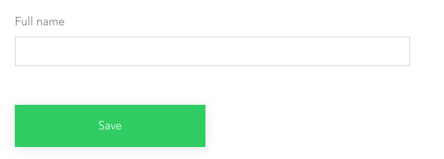
**More about all params & events below.**
---
# Usage
## Descriptions
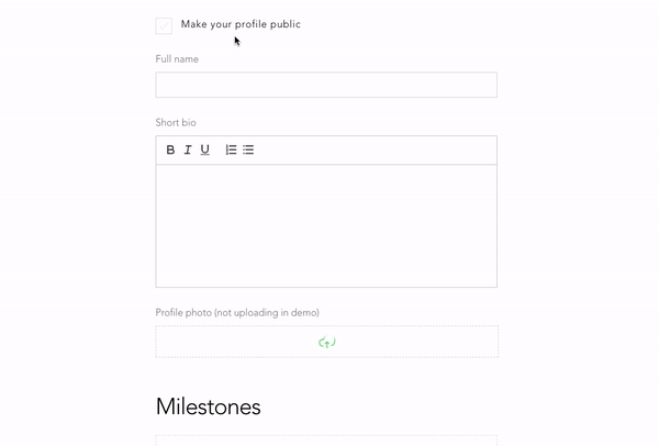
Your JS Data is described by another JS Object targeting all nodes which should be rendered on the screen. Imagine a data model of a IMDB movie:
```javascript
{
author: {
name: "J. Cameron",
birth: "2020-09-08T12:11:03.332Z",
active: true
}
title: "Titanic",
description: "Lorem ipsum ...",
language: "English",
genres: ["Action", "Drama"]
}
```
...the descriptions could look something like this:
```javascript
{
author: { view: "group", label: "Author" },
author.name: { view: "text", label: "Name of author" },
author.birth: { view: "datetime", label: "Date of birth" },
author.active: { view: "tick", label: "Is the author still active?" },
title: { view: "text", label: "Movie title" },
description: { view: "area", "label": "Description" },
genres: { view: "checkbox", "label: "Genres", options: ["Action", "Comedy", "Drama"] },
language: { view: "select", label: "Original language", "options: ["English", "Spanish", "Korean"] }
}
```
**Description paths**
So as you can see nodes are targeted by a dotted notation. Each description object has a required value of `view`, which specifies, to which UI element should the node be rendered. Currently there is 11 basic view types, though you can specify your own (see _Custom views_).
### Wildcard paths
If you want to describe every array's child, you can use the **wildcard path**. Look closely at this data set:
```javascript
{
programme: [
// Day 1
{
header: 'Friday',
subheader: '25th September 2020',
items: [
// Item 1
{
title: 'Arrival',
subtitle: 'please be on time',
time: '9AM'
},
// Item 2
{
title: 'Workshop 1',
subtitle: 'hosted by John Doe',
time: '11AM'
}
// Item 3 ...
},
// Day 2 ...
],
}
```
The wildcard paths can be leveraged like this:
```javascript
programme: { view: 'collection' },
programme[*]: { view: 'group', label: 'Day no. {_index}' }, // more about the {_index} at Dynamic values
programme[*].header: { type: 'text', label: 'Title' },
programme[*].subheader: { type: 'text', label: 'Short description' },
programme[*].items: { type: 'collection', label: 'Sessions' },
programme[*].items[*]: { type: 'group' },
programme[*].items[*].title: { type: 'text', label: 'Session name' },
programme[*].items[*].subtitle: { type: 'area', label: 'About' },
programme[*].items[*].time: { type: 'text', label: 'Time of start' },
```
### Dynamic values
Any view type can have a String in description value. If the string is found in provided `functions` set, given function gets executed. The function also receives the child's path and value as a parameter.
```jsx
{
view: 'group'
hidden: '_groupHidden'
}
```
...while in JS code
```jsx
data() {
return {
myFunctions: {
'_groupHidden': this.groupHidden,
'_groupIndex': this.groupIndex,
},
};
},
methods: {
groupHidden({path, value}) {
return value.item < 0;
},
groupIndex({path}) {
return this.getIndex(path);
}
},
```
Methods can be also put inline to the string. For these cases, the dynamic value needs to be wrapped inside the brackets.
```jsx
{
view: 'group'
label: 'Day no. {_groupIndex}'
}
```
Check the [demo's source code](https://github.com/marekmensa/vue-dd-form/blob/master/docs-src/components/Home.vue) to see it in use.
### Side note to Descriptions
The order of descriptions defines the order of the views on the UI. It is also needed to describe first the Object and then it's sub-nodes.
---
## View types
There is 11 basic view types included in this package:
- group
- collection
- text
- area
- select
- checkbox
- counter
- datetime
- upload
- radio
- tick
## collection
Serves as Array container and expects to have multiple inner children. Collection shows just an add-child button by default. It is only an abstraction and has no visual representation.
**Usage**
```jsx
{
view: 'collection',
}
```
**Possible value types**
_(Array)_: Consumes only `array`
**Arguments**
- `label` _(String)_: Shows title on the top of the view
- `class` _(String or Array)_: View's assigned class
- `wrapper` _(String)_: Name of the view's wrapper
- `hidden` _(Boolean)_: Hides or shows the view
- `draggable` _(Boolean)_: Allows or disallows children dragging
- `deletable` _(Boolean)_: Allows or disallows children delete
- `addable` _(Boolean)_: Allows or disallows to add children
- `defaultValue` _(*)_: Override of view's default value
## group
Serves as Object container and expects to have nested children. It is only an abstraction and has no visual representation.
**Usage**
```jsx
{
view: 'group',
}
```
**Possible value types**
`(Object) or null`: Consumes only `object`
**Arguments**
- `label` _(String)_: Shows title on the top of the view
- `class` _(String or Array)_: View's assigned class
- `wrapper` _(String)_: Name of the view's wrapper
- `hidden` _(Boolean)_: Shows or hides the view
- `append` _(Object)_: Specifies the UI invisible appendant data to be merged with the object (triggered while adding new item to array)
- `defaultValue` _(*)_: Override of view's default value
## text
Acts as a basic single-line text field.
**Usage**
```jsx
{
view: 'text',
}
```
**Possible value types**
`String`: Consumes only String
**Arguments**
- `label` _(String)_: Shows title on the top of the view
- `class` _(String or Array)_: View's assigned class
- `hidden` _(Boolean)_: Hides or shows the view
- `wrapper` _(String)_: Name of the view's wrapper
- `defaultValue` _(*)_: Override of view's default value
## select
Acts as a drow-down box.
**Usage**
```jsx
{
view: 'select',
}
```
**Possible value types**
`String or null`: Consumes String or null
**Arguments**
- `label` _(String)_: Shows title on the top of the view
- `class` _(String or Array)_: View's assigned class
- `hidden` _(Boolean)_: Hides or shows the view
- `wrapper` _(String)_: Name of the view's wrapper
- `options` _(Array)_: Field option values
- `defaultValue` _(*)_: Override of view's default value
- **Plain mode**
```jsx
["Dog", "Cat"]
```
- **Value-text mode**
```jsx
[
{ text: "Dog", value: "doggo" },
{ text: "Cat", value: "caterpillar" }
]
```
## checkbox
Acts as a checkbox set.
**Usage**
```jsx
{
view: 'checkbox',
}
```
**Possible value types**
`Array`: Consumes Array of strings
**Arguments**
- `label` _(String)_: Shows title on the top of the view
- `class` _(String or Array)_: View's assigned class
- `hidden` _(Boolean)_: Hides or shows the view
- `wrapper` _(String)_: Name of the view's wrapper
- `options` _(Array)_: Field option values
- `defaultValue` _(*)_: Override of view's default value
- **Plain mode**
```jsx
["Dog", "Cat"]
```
- **Value-text mode**
```jsx
[
{ text: "Dog", value: "doggo" },
{ text: "Cat", value: "caterpillar" }
]
```
## counter
Acts as a counter box.
**Usage**
```jsx
{
view: 'counter',
}
```
**Possible value types**
`Number`: Consumes a Number
**Arguments**
- `label` _(String)_: Shows title on the top of the view
- `class` _(String or Array)_: View's assigned class
- `hidden` _(Boolean)_: Hides or shows the view
- `wrapper` _(String)_: Name of the view's wrapper
- `min` _(Number)_: Minimum value to select
- `max` _(Number)_: Maximum value to select
- `defaultValue` _(*)_: Override of view's default value
## datetime
Acts as a date-time selection field.
**Usage**
```jsx
{
view: 'datetime',
}
```
**Possible value types**
`Date or String`: Consumes a Date, String or Timestamp (Firebase) but always returns Date
**Arguments**
- `label` _(String)_: Shows title on the top of the view
- `class` _(String or Array)_: View's assigned class
- `hidden` _(Boolean)_: Hides or shows the view
- `wrapper` _(String)_: Name of the view's wrapper
- `min` _(String_)*: Minimum date value
- `max` _(String_)*: Maximum date value
- `defaultValue` _(*)_: Override of view's default value
_* String in a Date format_
## upload
Acts as a box for file uploads and renders into preview box, if consumable by web (image, video, ...).
**Usage**
```jsx
{
view: 'upload',
}
```
**Possible value types**
`String`: Consumes a String
**Arguments**
- `label` _(String)_: Shows title on the top of the view
- `class` _(String or Array)_: View's assigned class
- `endpoint` _(String)_: API endpoint URL*
- `payload` _(Object or String)_: API payload data*
- `hidden` _(Boolean)_: Hides or shows the view
- `wrapper` _(String)_: Name of the view's wrapper
- `defaultValue` _(*)_: Override of view's default value
_* Endpoint URL receives a POST call with FormData (`image` and `payload`)_
** Note from author**
File upload functionality is heavily domain-oriented, thus I'd advise you to clone the [ViewUpload.vue]([https://github.com/marekmensa/vue-dd-form/blob/master/src/views/ViewUpload.vue](https://github.com/marekmensa/vue-dd-form/blob/master/src/views/ViewUpload.vue)), modify it by your needs and use it as a **Custom view**.
## area
Acts as a multi-line text field with optional WYSIWYG editor.
**Usage**
```jsx
{
view: 'area',
}
```
**Possible value types**
`String`: Consumes only String
**Arguments**
- `label` _(String)_: Shows title on the top of the view
- `class` _(String or Array)_: View's assigned class
- `hidden` _(Boolean)_: Hides or shows the view
- `wrapper` _(String)_: Name of the view's wrapper
- `html` (Boolean): Whether or not to allow WYSIWYG features
- `defaultValue` _(*)_: Override of view's default value
## radio
Acts as a radio button set.
**Usage**
```jsx
{
view: 'radio',
}
```
**Possible value types**
`String`: Consumes a String or null
**Arguments**
- `label` _(String)_: Shows title on the top of the view
- `class` _(String or Array)_: View's assigned class
- `hidden` _(Boolean)_: Hides or shows the view
- `wrapper` _(String)_: Name of the view's wrapper
- `options` _(Array)_: Field option values
- `defaultValue` _(*)_: Override of view's default value
- **Plain mode**
```jsx
["Dog", "Cat"]
```
- **Value-text mode**
```jsx
[
{ text: "Dog", value: "doggo" },
{ text: "Cat", value: "caterpillar" }
]
```
## tick
Acts as a single checkbox.
**Usage**
```jsx
{
view: 'tick',
}
```
**Possible value types**
`Boolean`: Consumes a Boolean
**Arguments**
- `label` _(String)_: Shows title on the top of the view
- `class` _(String or Array)_: View's assigned class
- `hidden` _(Boolean)_: Hides or shows the view
- `wrapper` _(String)_: Name of the view's wrapper
- `defaultValue` _(*)_: Override of view's default value
## Custom views
Any custom view can be inserted via `:views` property. Custom views are superior to the default ones, so `text` can be overwritten by a custom one.
Usage:
- pass a Object of components to `:views` property in dd-form
- component will receive `path, value and description` properties
- the component must emit a @change event with `value and path` properties
```jsx
customViews: {
'text': customTextView,
'generator': generatorView,
}
```
```jsx
import customTextView from 'path/to/custom-view';
```
...and bind the data in dd-form
```jsx
```
**Check the [demo's source code](https://github.com/marekmensa/vue-dd-form/blob/master/docs-src/components/Home.vue) to see it in use.**
### Advanced: Sub-elements
Some sub-elements can be replaced too: `button-add`, `button-remove`, `button-submit`, `headline`.
```jsx
customViews: {
'collection.button-add': customButtonAdd,
'collection.headline': customHeadline,
'collection.button-remove': customButtonRemove,
'group.headline': customHeadline,
'group.button-submit': customButtonSubmit,
}
```
---
## Other features
### Language customization
vue-dd-form provides a `:lang` property, which can rewrite the default language wording.
```jsx
```
...and the lang object
```jsx
customLang: {
add: 'Add item',
remove: 'Remove item',
save: 'Save data'
}
```
### Wrappers (beta)
Views can be wrapped inside separate boxes (DIVs) so we can position them in any way. Look at example data:
```jsx
{
programme: [
{
header: 'Friday',
subheader: '25th September 2020',
items: [
...
],
}
```
If we wanted, for instance, to have header and sub-header on the left side of the screen and items on the right, the descriptions would look as follows:
```jsx
programme[*].header: { type: 'text' },
programme[*].subheader: { type: 'text', wrapper: 'left' },
programme[*].items: { type: 'collection', wrapper: 'left' },
```
In result HTML, the views would look like this
```html
```
Afterwards, only thing to be defined are the CSS classes. Check the [demo's source code](https://github.com/marekmensa/vue-dd-form/blob/master/docs-src/components/Home.vue) to see it in use.
---
## Events
`@change` fired after any value change, emits path, value changed & current data set
```html
change({ path, value, data }) {
// eslint-disable-next-line no-console
console.log(path, value); // ex. => 'programme[*].header', 'Friday'
console.log(data); // ex. => { ... }
},
```
`@submit` fired after form submit, emits data value
```jsx
submit({ data }) {
// eslint-disable-next-line no-console
console.log(data); // ex. => { ... }
},
```
`@add` fired after a item is added to a collection, emits path, value added & current data set
```html
add({ path, value, data }) {
// eslint-disable-next-line no-console
console.log(path, value); // ex. => 'programme[*].options', { header: 'Friday', ... }
console.log(data); // ex. => { ... }
},
```
`@remove` fired after a item is added to a collection, emits path, value removed, index & current data set
```html
remove({ path, value, data, index }) {
// eslint-disable-next-line no-console
console.log(path, value); // ex. => 'programme[*].options', { header: 'Friday', ... }
console.log(data); // ex. => { ... }
console.log(index); // ex. => 1
},
```
---
## Styling
Form can be styled in verious ways depending on the depth of the adjustment:
- Any view can be assigned a class parameter. Class can be your custom one or one of the helper classes below.
- Any view in a group view can be assigned a wrapper parameter (see Wrappers).
- If none of above does not fulfill your needs, you can override or define your own views (see Custom views)
### Helper classes
- `col--1-3` (sets width to 1/3 of the available space)
- `col--2-3` (sets width to 2/3 of the available space)
- `col--1-2` (sets width to one half of the available space)
- `col--1-1` (sets full-width)
- `row` (makes the div's direction inline)
- `row--boxed` (makes the div's direction inline & puts it in a shadowed box)
- `row--responsive` (makes the div's direction inline, but wraps on mobile)
### Other classes appearing in UI
- `view`
- `view—root`
- `view—branch`
- `view—leaf`
- `view__container`
- `view__container—removable`
- `view__wrapper—removable`
- `button`
- `button—add`
- `button—remove`
- `button—submit`
- `headline`
# Conclusion
There are many useful things which are still not yet implemented (validation, CDN availability etc.). I'd be very thankful for any contributions! Described-Data would work the best if it was multi-platform so if you feel like cooperating (React etc.), hit me up!
# License
[The MIT License](http://opensource.org/licenses/MIT)